
New Death Row Records
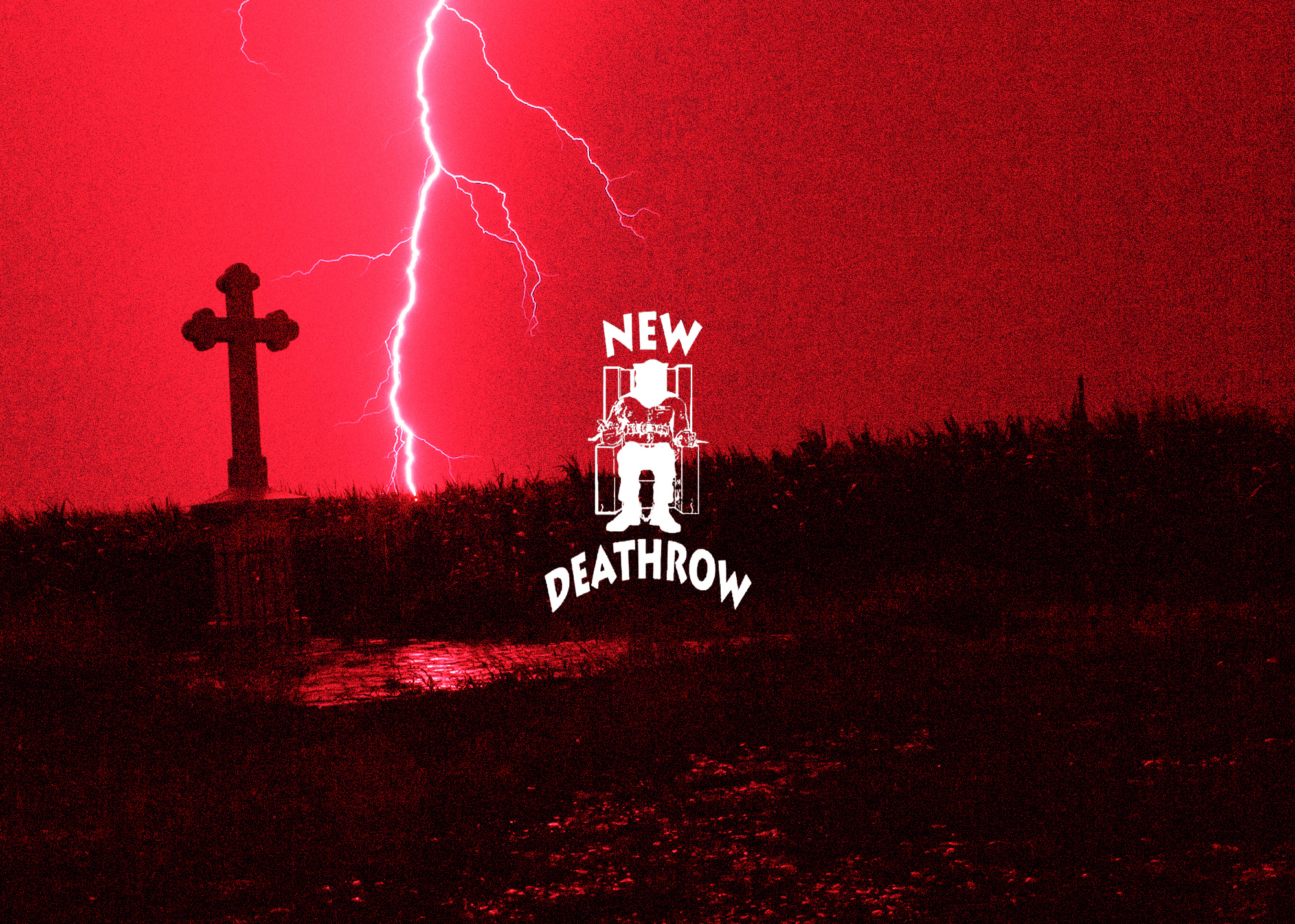
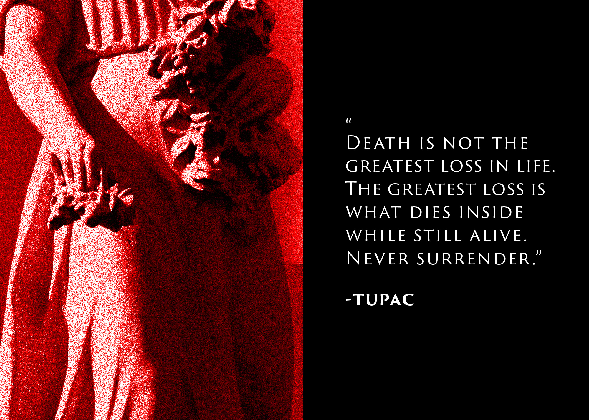
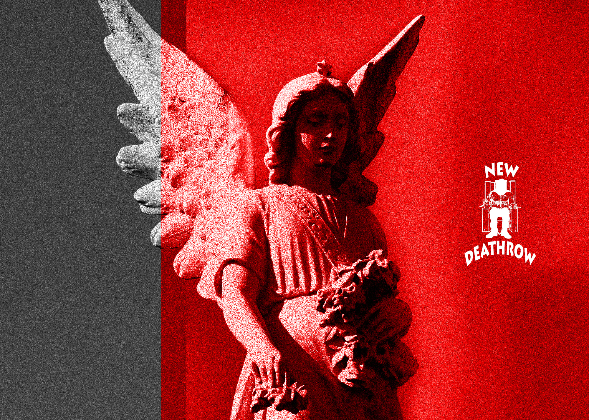
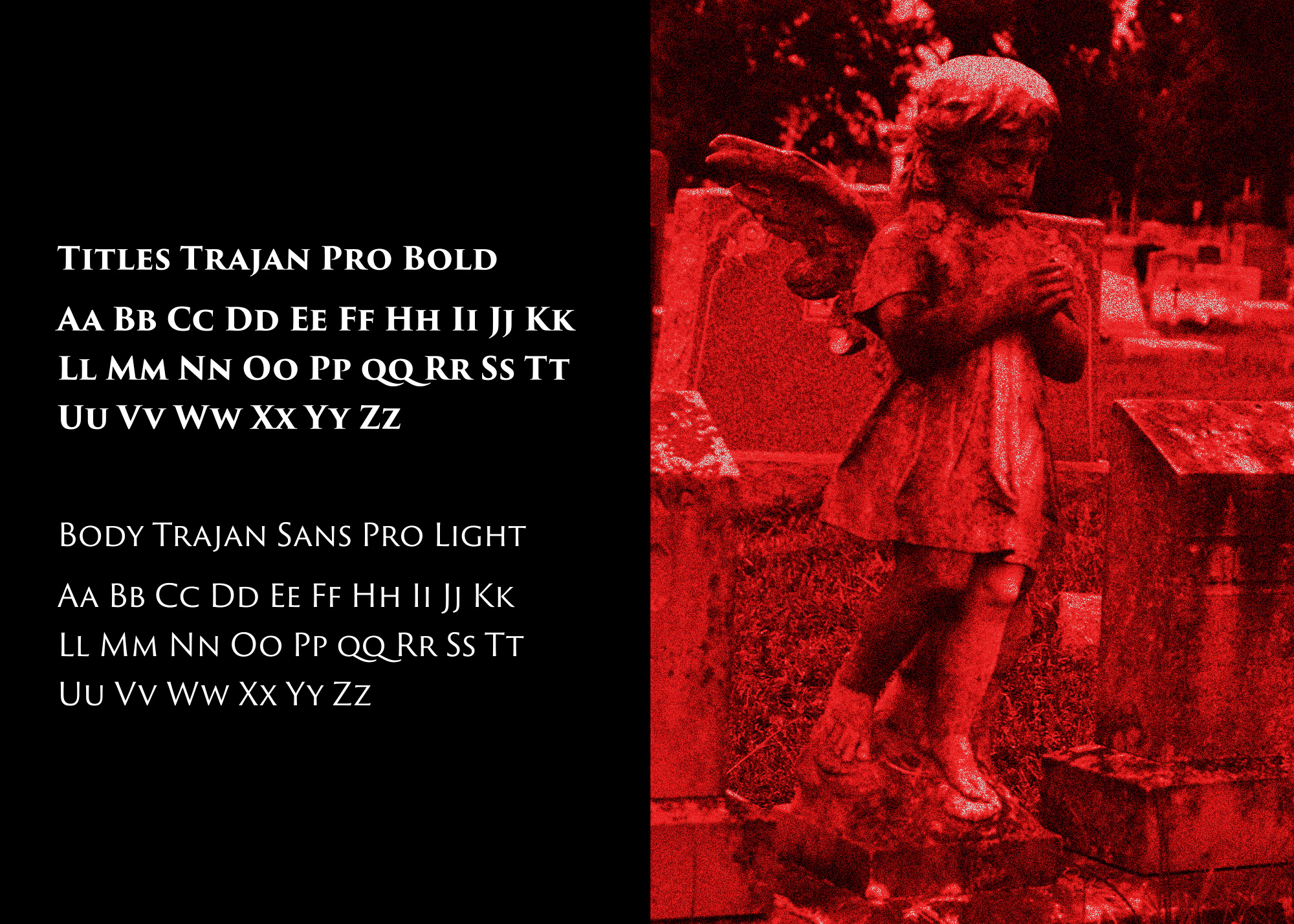
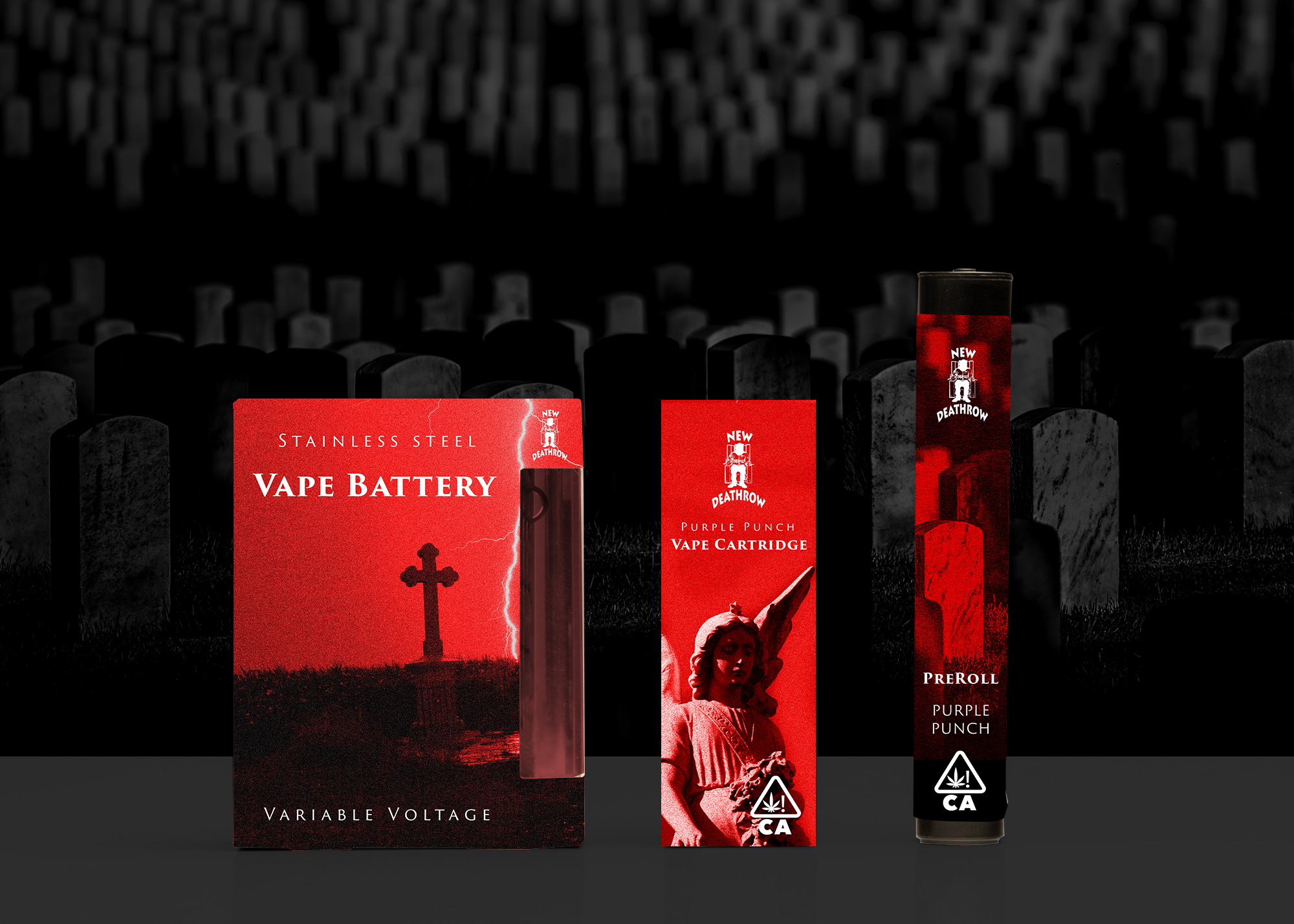
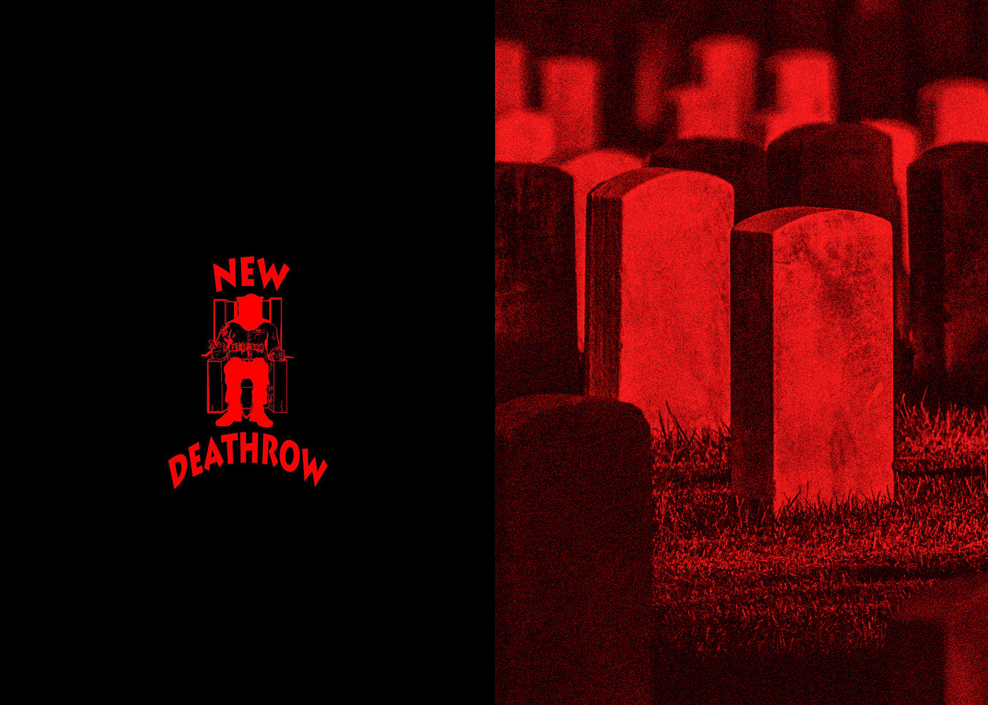
New Death Row Records approached me about creating a line of packaging for a new cannabis line they wanted to release. Being familiar with the legendary music that was made under the label I was very excited to say the least. New Death Row had very limited assets to provide us to get started and no style guide so the small team I lead had a relatively blank canvas to start with. The parameters: NO BLUE, and they like the use of serif fonts. We got to work crafting a direction infusing the brand’s street heritage, through the use of gritty textures and black letter feeling typefaces with its ominous death laden presence cue’d by imagery of cemeteries and religious icons. In the end we created a direction they loved, that could transcend the packaging and expand into their visual identity, but unfortunately the project never saw a public release.